Tab Pages
This page is a stub. Help us expand it!
Overview
Complex plugins often need multiple configuration sections. Unraid provides a tab interface for organizing settings into logical groups.
Here’s how Unraid’s tab interface looks in the Plugins page:
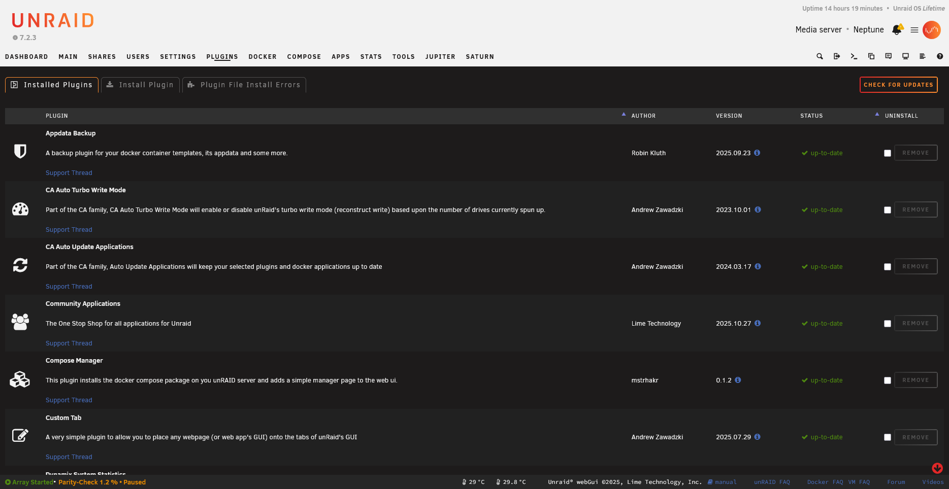
📷 Screenshot needed: Plugin with multiple tabs showing custom plugin tabs

Basic Tab Structure
Tabs consist of clickable tab headers and corresponding content panels. Use data-tab attributes to link headers with their content. Only one tab’s content is visible at a time—JavaScript handles showing/hiding based on which tab is clicked.
<?
// Tab page structure example
?>

<div class="tabs">
    <div class="tab" data-tab="general">General</div>
    <div class="tab" data-tab="advanced">Advanced</div>
    <div class="tab" data-tab="about">About</div>
</div>

<div class="tab-content" data-tab="general">
    <!-- General settings content -->
    <form method="POST">
        <input type="hidden" name="csrf_token" value="<?=$var['csrf_token']?>">
        <!-- Form fields -->
    </form>
</div>

<div class="tab-content" data-tab="advanced">
    <!-- Advanced settings content -->
</div>

<div class="tab-content" data-tab="about">
    <!-- About/info content -->
</div>
JavaScript for Tabs
This jQuery code handles tab switching. When a tab is clicked, it adds the active class to highlight it, hides all content panels, then shows only the panel matching the clicked tab’s data-tab value. The first tab is activated automatically on page load.
$(function() {
    // Tab switching
    $('.tab').on('click', function() {
        var tabId = $(this).data('tab');

        // Update tab state
        $('.tab').removeClass('active');
        $(this).addClass('active');

        // Show content
        $('.tab-content').hide();
        $('.tab-content[data-tab="' + tabId + '"]').show();
    });

    // Activate first tab
    $('.tab:first').click();
});
Page Header with Tabs
Some Unraid page types support a Tab header attribute that enables the built-in tabbed interface. This integrates with Unraid’s native tab styling rather than requiring custom tab implementation.
Menu="Settings"
Title="My Plugin"
Icon="cog"
Tab="true"
TODO: Document actual tab header syntax
Preserving Tab State
Save and restore the selected tab:
$(function() {
    // Restore saved tab
    var savedTab = localStorage.getItem('yourplugin-tab');
    if (savedTab) {
        $('.tab[data-tab="' + savedTab + '"]').click();
    }

    // Save tab on change
    $('.tab').on('click', function() {
        localStorage.setItem('yourplugin-tab', $(this).data('tab'));
    });
});
Tab-Specific Forms
Each tab can have its own form with independent submission:
<div class="tab-content" data-tab="general">
    <form method="POST" action="/plugins/yourplugin/save-general.php">
        <input type="hidden" name="csrf_token" value="<?=$var['csrf_token']?>">
        <!-- General settings -->
        <input type="submit" value="Apply">
    </form>
</div>

<div class="tab-content" data-tab="network">
    <form method="POST" action="/plugins/yourplugin/save-network.php">
        <input type="hidden" name="csrf_token" value="<?=$var['csrf_token']?>">
        <!-- Network settings -->
        <input type="submit" value="Apply">
    </form>
</div>
Multi-Page Tabs
For very large plugins, use separate .page files that appear as tabs:
# plugins/yourplugin/YourPlugin.page
Menu="Settings"
Title="My Plugin"
Icon="cog"
---

# plugins/yourplugin/YourPluginAdvanced.page
Menu="Settings:2"
Title="My Plugin Advanced"
Icon="cog"
---
TODO: Document the Menu numbering system for related pages
Styling Tabs
.tabs {
    display: flex;
    border-bottom: 1px solid var(--border-color);
    margin-bottom: 20px;
}

.tab {
    padding: 10px 20px;
    cursor: pointer;
    border-bottom: 2px solid transparent;
}

.tab.active {
    border-bottom-color: var(--primary-color);
    font-weight: bold;
}

.tab-content {
    display: none;
}

.tab-content.active {
    display: block;
}
Best Practices
- Keep related settings together
- Use clear, descriptive tab names
- Don’t create too many tabs (3-5 is usually ideal)
- Consider user workflow when ordering tabs
- Save tab state for better UX